Audit & remediation record
The perfect score was hiding four Level A failures.
Before this audit, automated tooling said naxatar.com was in fine shape: Lighthouse averaged 97.2 across seventeen routes and gave the homepage — the most complex page on the site — a clean 100/100, with zero axe-core violations. That homepage carried four Level A failures. This is the record of what was actually wrong, how it was found, and the evidence that it is fixed — on the live site, not a local build.
Before → after
- axe-core violation nodes
-
2140 20 routes × 2 themes = 40 scans · 0 on production too - Lighthouse accessibility, mean
-
97.2100.0 17 routes at audit time; re-measured at 100.0 across all 20 today - Success criteria failing
-
110 16 defects total — some criteria failed in more than one place - Homepage tab stops on invisible content
-
18 / 350 / 36 focus landed on content painted at opacity 0 - Controls hidden behind the fixed header
-
400 measured over 181 controls on 6 pages - Looping animations after “background off”
-
390 the toggle previously stopped only the WebGL layer - Pages with a working skip link
-
0 / 1719 / 20 the standalone visual essay has no shared layout - Live regions announcing async results
-
17 form results previously changed silently
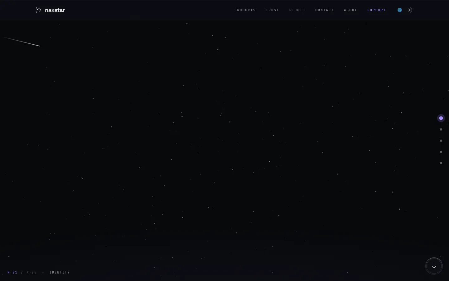
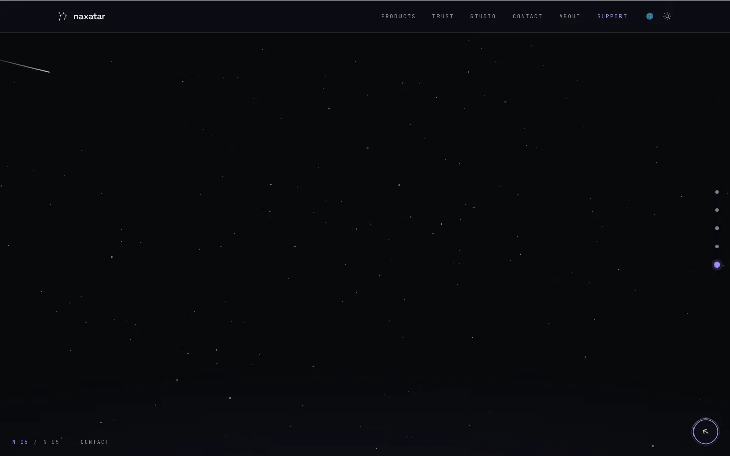
A keyboard user could black out the homepage.
The homepage is a locked full-page deck: the document never scrolls, the deck slides.
Nothing in it followed keyboard focus. Pressing Tab
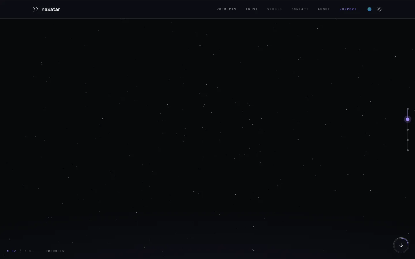
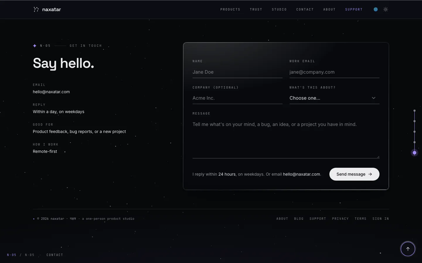
moved focus into slides the pager had never revealed — their content sat at
opacity: 0 —
while the browser silently scrolled the pager's shell as far as 3,482 pixels to
compensate. The visitor ended up typing into an invisible contact form over an empty
starfield, and one arrow key later the page showed nothing at all.
No scanner can see this. It is not a missing attribute or a bad colour — it is an interaction between a locked pager, a CSS reveal, and the browser's scroll-into-view behaviour. Finding it took tabbing the page and asking a question no tool asks: is the thing I just focused actually being painted?
Before
After
Before
After
The same defect had a second entrance: VoiceOver's reading cursor moves
without moving DOM focus, so the first fix — following
focus — didn't cover it, and a live VoiceOver pass caught the screen going blank while the
speech stayed correct. The durable rule was the invariant, not the event: the pager's shell
is overflow: hidden,
so any scroll of it is illegitimate, whoever caused it — and is
now converted into real navigation.
Sixteen defects, eleven criteria — the scanners caught three.
axe found two of the eleven failing criteria and Lighthouse a third. The rest came from keyboard traversal, computing ratios from the design tokens, applying WCAG's text-spacing metrics, hover-content checks, and a screen reader. All sixteen are closed.
| Criterion | Level | Found by | The defect |
|---|---|---|---|
| 2.1.1 Keyboard | A | Manual | The homepage deck ignored keyboard focus — 18 of 35 tab stops put focus on unpainted content, including every contact-form field |
| 2.4.3 Focus Order | A | Manual | The page’s position indicator read “slide 1 of 5” while focus sat in the form on slide 5 |
| 2.4.7 Focus Visible | AA | Manual | An indicator cannot be visible when the control it surrounds is painted at opacity 0 |
| 2.1.1 Keyboard | A | axe | A screenshot strip with nothing focusable inside — 4 of its 5 images unreachable without a mouse |
| 2.2.2 Pause, Stop, Hide | A | Manual | 39 infinitely looping animations; the one background control stopped only the WebGL galaxy |
| 2.4.1 Bypass Blocks | A | Manual | No skip link on any page; nine header controls before the content, every time |
| 1.4.1 Use of Color | A | Manual | A link inside prose distinguished from its surrounding text by lightness alone — 2.92:1, under the 3:1 required |
| 1.3.1 Info and Relationships | A | Lighthouse | Heading levels jumped h1 → h3 on both product pages; one page had no heading at all |
| 1.4.3 Contrast (Minimum) | AA | axe | 214 failing nodes across 9 routes, from two colour tokens — the site’s quiet grey measured 2.24:1 |
| 1.4.11 Non-text Contrast | AA | Manual | Every form field’s only visual boundary was a 1.32:1 hairline |
| 1.4.12 Text Spacing | AA | Manual | Applying WCAG’s own text metrics cut 55px of content away inside an overflow:hidden slide, unreachably |
| 1.4.13 Content on Hover or Focus | AA | Manual | The hover tooltip was neither dismissable (Escape did nothing) nor hoverable (pointer-events: none), and obscured text |
| 2.4.11 Focus Not Obscured | AA · new in 2.2 | Manual | 40 controls came to rest entirely behind the fixed header after anchor jumps |
| 3.1.2 Language of Parts | AA | Manual | Devanagari (नक्षत्र) in nine places inside lang="en" — pronounced with English rules |
| 4.1.2 Name, Role, Value | A | Manual | A role="radiogroup" where each radio was its own tab stop and the arrow keys did nothing |
| 4.1.3 Status Messages | AA | Manual | One live region on the whole site; contact-form results announced nothing to a screen reader |
Three found after this report was first published.
Kept separate rather than folded into the sixteen above, because when something was found is part of the evidence. One is a regression the harness caught on a later run — which is the argument for keeping the harness and the rules in the repository rather than in one person's head.
| What | Level | Found by | The defect, and the fix |
|---|---|---|---|
| Deck vs. a reading cursor | — | VoiceOver + measurement | The deck followed an assistive reading cursor forward but not backward: its shell sat pinned at scrollTop 0, so an upward scroll had no room and produced no event to follow. The reader announced the hero while the screen showed the contact slide. Fixed by making the shell’s scroll position the deck’s position, so a cursor has somewhere to scroll either way — verified in all eight reading directions on production. Not a success-criterion failure, since none requires the viewport to follow a reading cursor, but a real barrier for anyone using speech and sight together. |
| 2.2.2 Pause, Stop, Hide | A | Harness, on a later run | A regression, and the reason the harness runs on every change. The hero wordmark was exempted from the background-motion freeze on the reasoning that a logo is brand rather than background. That left 16 looping animations running after the visitor had asked for the motion to stop, so the mechanism no longer existed and this criterion failed for a period in which the report claimed it held. The exemption was removed: 39 animations running before the toggle, 0 after. |
| contentinfo landmark | — | External scan, verified by hand | The footer colophon sat inside <main>, where a <footer> element is not exposed as contentinfo at all, so the site offered no footer landmark to jump to. It is now a sibling of <main> in the layout, on 19 of 20 routes. Not a criterion failure; a real navigation improvement. |
Why the tools couldn't see it — in both directions.
On the homepage, axe returned fourteen contrast checks as “incomplete” — neither pass nor fail — because it cannot resolve a backdrop made of translucent glass over a WebGL canvas: “element's background color could not be determined because element contains an image node.” Those fourteen were settled by computing ratios directly from the design tokens. The two scanners also disagreed with each other: Lighthouse reported contrast failures on two routes where axe recorded none, because a different viewport renders a different set of elements.
Careful measurement cuts the other way too. A size-threshold reading of target size (2.5.8) flags 21 failures on this site. Applying the criterion's actual spacing and inline exceptions — computing whether a 24-pixel circle on one target's centre reaches another's — gives zero. All 21 would have been false findings in the conformance report.
Fixed without touching the design.
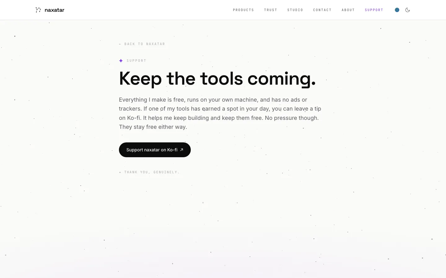
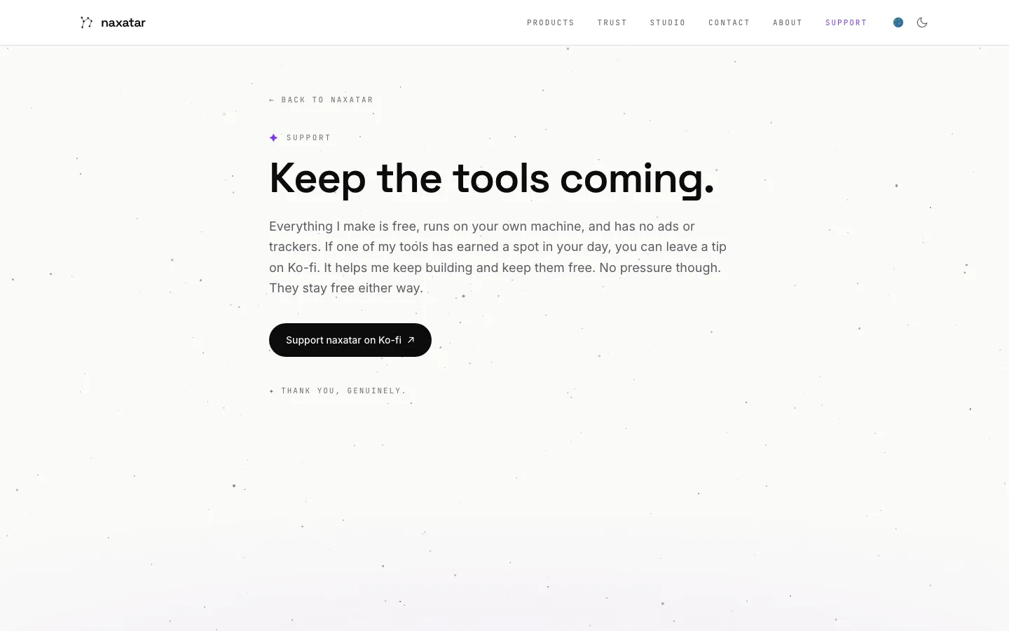
The remediation is +260/−48 lines across 22 files — no design-system refactor, no new UI. Every colour correction was solved for the smallest change that crosses the WCAG threshold, hue held, so the site's quiet visual register survived. The pair below carries a 2.24:1 → 4.85:1 correction on the eyebrow, the back link and the closing line. Nothing else moved.
Before · 2.24:1
After · 4.85:1
Verified where a stranger can check it.
- Re-audited against the deployed production site, not a local build: 0 axe violations across 34 scans, 0 unpainted focus stops, 0 controls behind the header.
- Repeated in all three browser engines a screen reader can sit on — Chromium, WebKit and Gecko: the exposed role, name and state of 21 controls agreed across all three, with the same live regions and identical keyboard behaviour from the custom radio group.
- Screen-reader testing: VoiceOver on macOS, which found a defect nothing else had. NVDA and JAWS were not tested — the conformance report says so in those words rather than implying broader coverage.
- Three of the fixes were themselves defective on the first attempt — a focus ring that would have squared the pill buttons, a skip link revealed on the wrong pseudo-class, and the VoiceOver path above. Each was caught by re-verification and is documented, because remediation that audits itself is the difference between a fix and a claim.
- The whole harness — axe and Lighthouse runners plus purpose-written probes for keyboard traversal, target-size exceptions, focus obscuring, motion, and text spacing — is published in the site's repository, so every number above can be reproduced.
Full detail: the conformance report · the accessibility statement · audited August 2026 by the site's developer · last re-verified 20 August 2026